FOREVER - Apple Motion 5 breakdown
Often people ask me about how I make videos. I am not formally trained in animation or video editing, so I’m always reluctant to share any in-depth explanations, for fear of being seen for the hack that I am. But I’ve come to realise that over the years I’ve developed a way of doing things that works for me, and while I’m sure it doesn’t resemble any professional workflow, it might be of interest to some who want to do similar work.
So in writing up a kind of “making of” article about FOREVER, I’ll try and share not only the techniques I used in this video, but also some things I’ve learnt over years of stumbling blindly through the world of video production.
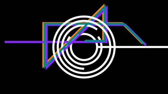
You can view the final work here.
1) There are no audio-reactive behaviours here
When I first discovered audio-reactive behaviours, I thought it was super exciting. My aim has often been to make extremely integrated and tightly synchronised audiovisual pairings, almost like we are seeing the actual music in abstract visual form. Audio-reactive behaviours promised to make that extremely easy, so I jumped straight on board with them.
I did make some videos with this technique, and it worked… ok. But what I have since realised is that our musical perception is one thing, and the actual audio waveform is quite another. Using audio-reactive techniques never quite looked as the music sounded to me. Music is way more than just fluctuating volumes at a range of frequencies - when we actually listen to music, its various elements conspire to transcend themselves and create an experience that cannot be described in a stream of transients or MIDI notes.
What I have since found way more effective is to just close my eyes, listen to the sounds, and imagine them as forms and motion. Then I just find ways to animate those forms manually. When I do this, the animation ideas are much richer, and actually couple better with the music than any automated process. No computer algorithm is really listening to music, not in the way humans do. So outsourcing music visualisation to automated processes can never really tap into the way that human minds actually perceive musical sounds.
The other good thing about doing this manually, is that things are easy to fix if they don’t look right. Getting audio-reactive behaviours right can be a long process of very finely calibrating the way a parameter responds to the wave. In some cases, I would even go back into my music software to create a bespoke version of a sound, just for the purpose of triggering something in the animation. It was when I started to doing that kind of thing that I realised that actually just animating it manually the way I want it actually takes less time.
Here are a couple of techniques I used which I think in this case worked much better than audio-reactive behaviours:
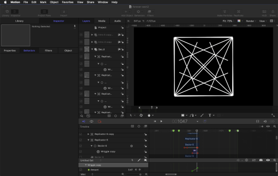
Wriggle behaviour, animating the “amount” parameter. Certain sounds in this track felt kind of taught or stretched like rubber bands, so the wriggle was useful to introduce subtle motion which kind of simulates physical tension. It also was really useful in that it helps to emphasise the snap to stillness - so I used it a lot in this piece, gradually increasing the wriggle amount towards a sudden freeze.
This unfolding box thingy was four replicators sourcing a simple line with its anchor point at the start of the line, so that changing the Replicator’s “Angle End” would fan the lines out. One key thing with the wriggle was resetting the Random Seed on each of the Wriggle behaviours, so that it didn’t look like they were all attached to each other, but more just vibrating separately in space.
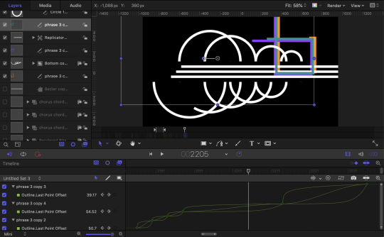
Using Logarithmic curves. Having had zero actual formal education in animation, I have come late to the importance of non-linear curves, so this may be elementary to some… but I find logarithmic curves are super nice for making something feel like it’s just been whacked with something. So that kind of motion pairs really nicely with drum hits and other percussive sounds. Sometimes the curve is a little too steep at the beginning, in which case you can use bezier to create a curve that is more to your liking. However, when the logarithmic curve is right, it’s cool because you can select a whole batch of keyframes and apply the logarithm instantly to all of them.
Maybe not the most direct example, but these coloured lines grow by animating their Last Point Offset in the Shape -> Outline parameters. They all share the same keyframes, but each uses a different curve (Logarithmic, Exponential, Ease In/Out). I found this to better match my perception of the phrases (I don’t know that I could explain why…) and also just added a nice bit of variety in the way the lines grow.
2) 2D is Cool Too
After first discovering basic 3D stuff I got a bit addicted to it, and every video I made had a lot of 3D elements. Recently, 2 things occurred to me about 3D:
- When it comes to 3D animation, actually viewers are accustomed to Pixar-level quality. When things that fail to achieve that, even a little bit, they feel kinda amateurish. I think you can successfully produce an aesthetic that uses 3D but sidesteps or negates that expectation, either by making it deliberately lofi or referencing an established contrasting style. But it’s an added challenge.
- 3D is just slower. The software runs slower, I can’t preview things as easily or as accurately, exporting things in the best possible quality with shadows and depth-of-field and all that stuff takes ages. Because I’m from a music production background I’m used to the creative flow of instantly hearing what I’m making, being able to export and resample audio in a project instantly, and never having to worry about my CPU maxing out.
So against these two facts, using strictly 2D in this animation was like a revelation for me. Stylistically I didn’t feel like I was constantly fighting against amateurishness, and my CPU was just humming happily the whole time, and never felt like a barrier to the creative flow.
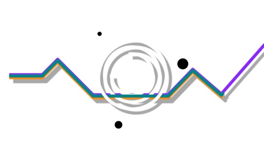
The other related thing that I rediscovered was THE DROP SHADOW. I first started dabbling in visuals in the early 2000s, and at this time, ‘drop shadow’ was like a dirty word. Imagine my surprise when I whimsically threw a drop shadow on a shape and realised that the whole aesthetic world had changed behind my back, and drop shadows now look non-ironically awesome. I expect you’ll see a lot of drop shadow in my future projects.
3) Use compatible tempos and framerates
This is something I’ve been doing for a long time, but think is valuable to share. Since I am creating the music and visuals together, I have control over BPM tempo and frame rates. Which is awesome, because if you conspire for these to be neatly related, it really makes animation much easier.
In other words, When you can have a BPM and Frame rate which result in a neat integer-number of frames per beat, then it’s much easier to manage the timeline and keyframes. FOREVER is 120bpm and 30fps, resulting in a neat 15 frames per beat. So I always knew, for example, if something’s duration needed to be four beats, then it would be 60 frames.
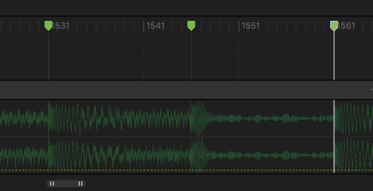
Then again I did have the dumb idea of incorporating a big accelerando (tempo ramp-up) into the final section, which really messed with things. So what I ended up doing with this is just animating it straight, without the tempo change, and then using markers to flag where the actual beats were during the accelerando, and the shifting all the keyframes across to snap onto the markers.
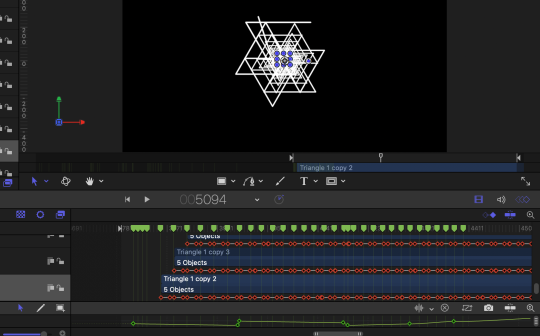
4) And Finally, MASKS.
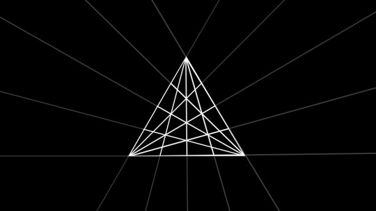
I found masking to be extremely useful in this project, especially in creating the kind of geometric shapes that I had in my head. Replicators are so useful for making interesting geometric patterns, but then if you use them as is, they can be kind of messy, and it doesn’t feel as controlled as it might if you were, say, drawing geometric shapes on grid paper. But in combination with masks, I found the replicators could make interesting internal geometries, while keep the shape outline really neat.
Here are two stills with the shape opacity reduced so that you can see what is being masked.

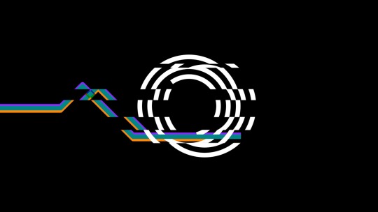
The other thing I used masks for in this was the glitchy effects in the back half of the chorus. This was done by creating a mask out of a bunch of moving horizontal lines, animated fairly random to shift up and down and change in size roughly with the rhythm of the music. This was used to mask a duplicate of the existing objects, and then once again, the Wriggle behaviour came in handy - the masked layer wriggles on the X axis, and I’ve animated the Wriggle Amount to be really dramatic on the accented beats of the music, and then considerable lower the rest of the time.
Here it is with the masking visible:
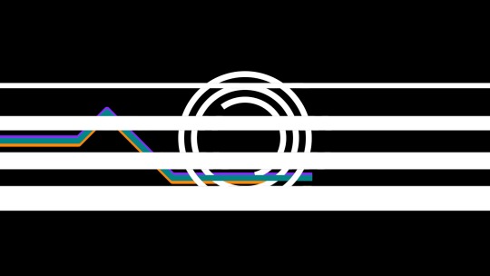
Here it is with the masking and Wriggle applied:
Here’s the Wriggle Amount parameter in the Key Frame Editor:

I hope that this is helpful or interesting reading for some. I will reiterate here that I am not a pro animator but in fact, a total self-taught hack, so I hope that this post is received as it is meant - an act of sharing, and absolutely not an assertion of expertise. I would love to hear from others who have related tips, or who can set me straight on anything in my workflow which is inefficient or weird. The thing that has drawn me to animation is that I feel like I am constantly learning new things, so I am excited to continue that journey!